Evergreen tips on how to write single software reviews & X vs. Y blogs that drive real results.

There are feature-centric software comparison blogs and then there are themed comparison pages.
Feature-centric blogs revolve around how a SaaS is better than the competition.
Themed comparison pages show how each SaaS is unique and serves subscribers with diverse creative needs.
This guide is for SaaS writers who want to create themed comparison content and for software brands that want to genuinely inspire prospects to take action.

A themed software comparison content ( AKA: comparative content) is a website marketing material you can use to pair your SaaS with other tools so subscribers know the right one for their needs.
It’s the deliberate act of comparing your software with competitors (or third-party tools) in a way that each brand’s use case, strength, stand-out features, and founding principles shine.
📌From your SaaS product positioning to narrative setting; to the passion and zeal behind your everyday coding activities, themed comparison content helps you tell subscribers WHY your product does WHAT it does and HOW it’s doing it.
📌 Themed SaaS comparison content helps your brand make a statement of not just what you offer (or how your product stands out) but also of WHY your brand exists beyond its products—a statement of your deepest beliefs.
📌 Themed comparison content is powerful for capturing mindshare in a way that builds trust, especially when written from the perspective of an INFINITE game plan rather than one-off conversion strategies.
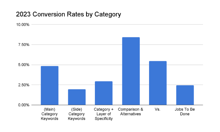
📌Competition comparison and alternative articles convert better than all other website marketing material combined. They contain high-intent keywords and persuasive arguments that inspire action faster than regular blogs or thought leadership articles.
📌 Plus, affiliate marketers need reliable information about your brand’s offerings. Themed competitor comparison content can help spotlight how your SaaS product is different.
🏁 Themed SaaS comparison pages and blogs, just like humans, need regular care and maintenance to thrive. They are living, breathing projects you must continually tend to as your product evolves.
🏁 Yes, there will be misfits. Some people who grew up in Nigeria never quite felt like they belonged; they were misfits in their own culture. Themed comparison pages serve only prospects who believe in your brand’s overall WHY.
🏁 Differences are simply DIFFERENCES. Being American is not better than being French. They are just different cultures—not better or worse, just different. So no! Your differences don’t make your SaaS the perfect fit for everyone.
🏁 Conversion metrics never tell the whole story; they only highlight the calculable side of things. Analyze your metrics and gain insights on content performance, but don’t act on them like they are the be-all and end-all of your comparative marketing campaign.
🏁 Indeed, it’s nice to optimize your themed comparison content for search engines using tools like SurferSEO or WriteSonic. But please, don’t jeopardize the quality or integrity of your content in search of vague, first-page ranking.
There are five major types of content in a software comparison campaign:
However, within three-way comparisons are X vs. Y vs. Z content and X vs. Y, then Z content. So expect six reviews in the coming section. 🙂

A product review page is a POSITIONING content that spotlights your SaaS use cases in a defined market.
It highlights the WHY, WHAT, and HOW behind your product in a specific niche, not in comparison to other SaaS competitors, but in alignment with your brand’s principles and use cases.
I love product review pages because they make it easy to address ideal subscriber’s pain points.
It can help you, in clear and precise terms, tell subscribers WHY they should choose you without the comparison bias.
Unlike a homepage, which houses every potential user, a product review page accommodates only those in a specific niche or industry.
For example, see how this Pipedrive review page helped position the CRM software as the go-to platform for realtors:
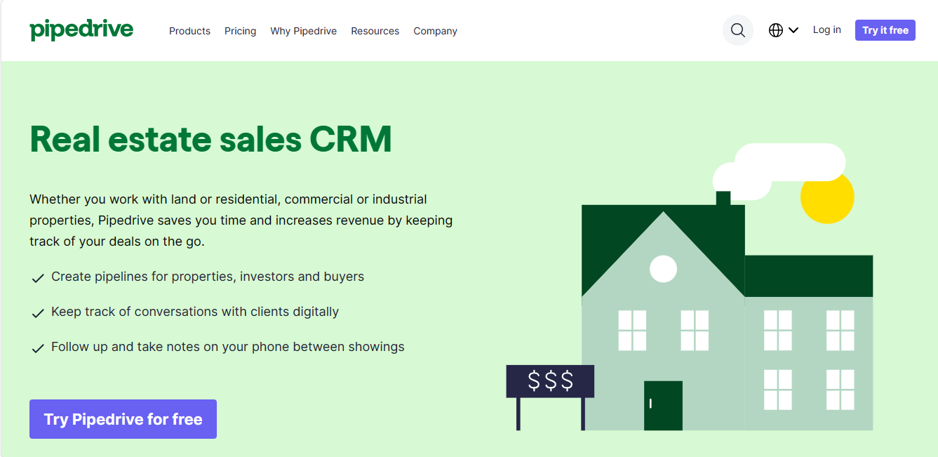
The tone of voice, pain points, and features discussed ONLY highlight how Pipedrive serves realtors.
But this simple attempt to make Pipedrive a go-to tool for realtors didn’t end here.
After a while, it not only drove up Pipedrive’s top-of-page bid for the keyword “Pipedrive for real estate…”
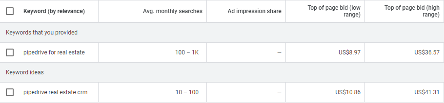
But also empowered affiliate reviews like this:
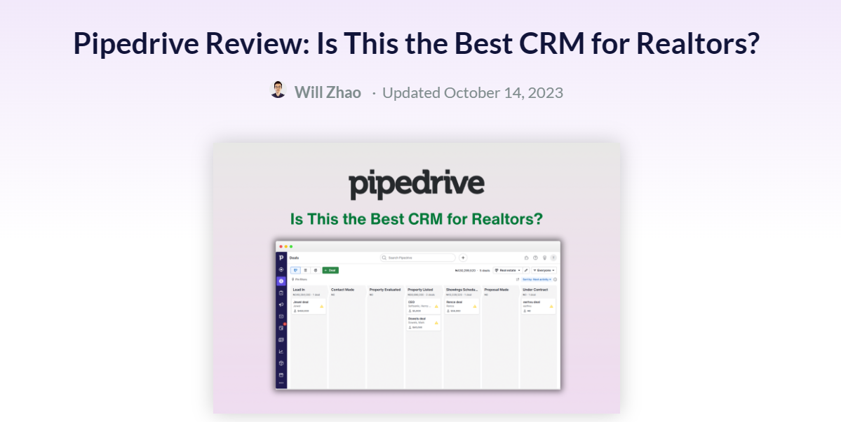
Indeed, if Pipedrive capitalizes on this traffic, it can dominate the real estate space for years.
That aside, here are other reasons you need a product review page:
🎁 It helps you control your overall WHY, how people think about your brand, and the beliefs they attach to it.
🎁 It helps highlight your unique value differentiators in a specific industry or niche market.
🎁 It gives affiliate marketers, influencers, and other subscribers interested in your SaaS a clear, unbiased view of your product.

When it comes to positioning, context setting is key.
And to set the RIGHT context, you must know your ideal subscribers – their beliefs, expectations, and inclinations – inside out.
Start by identifying your brand and product’s WHY, WHAT, and HOW.
For context, let’s imagine that we are trying to create a positioning narrative for Pipedrive’s CRM software comparison page; here are what typical answers to the above questions would read like:
With this narrative in mind, context setting becomes easy. You can speedily:
🎯 Optimize for Google
Optimizing a product review page for Google requires the same search intent and keyword strategies SaaS brands have been thriving on since its inception.
But don’t forget that blogs rank higher than landing pages on Google.
And undoubtedly, product reviews are better showcased as landing pages than blogs. To combat this issue, USE hybrid landing pages. Here’s an example from Hubspot:
🎯 Focus on specific use cases
For your product review to have a real, lasting impact, you can’t afford to tout every feature or benefit your SaaS offers.
You need to focus on specific use cases that tell an ideal customer how certain features will be relevant to their day-to-day.
For example, see how MouseFlow uses a product review page to position its analytic tool as the perfect choice for healthcare experts:

Key takeaways:
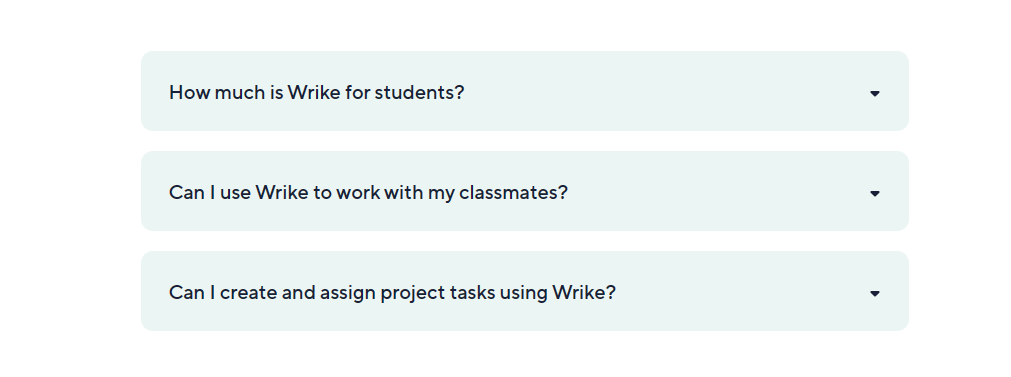
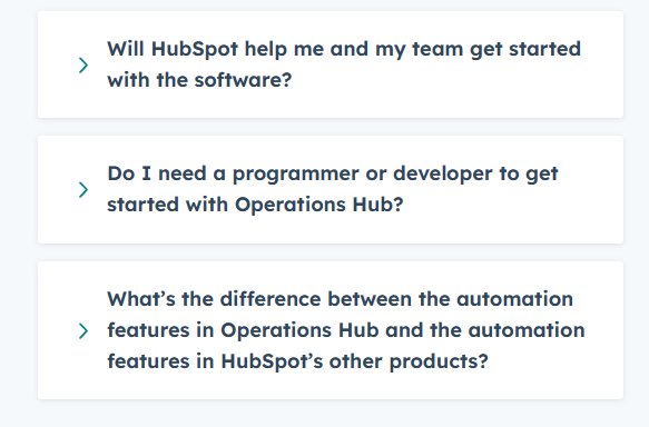
🎯 Answer FAQs
Subscribers about to make a decision never grow weary of questions. But your sales team might.
You can avoid the dilemma by including FAQs on your review page.
Here’s a plain example from Wrike:
OR a more sophisticated approach from HubSpot:
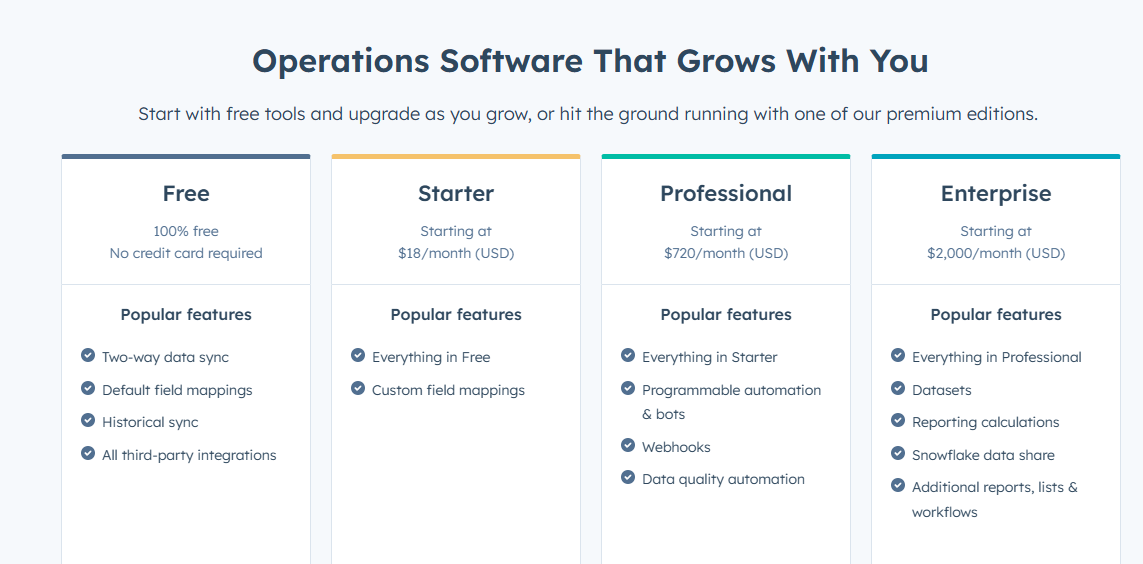
🎯 State price plans
Not including price plans in your product review page is equivalent to leaving money on the table.
Because YES! Budget-conscious prospects will walk away confused, wondering whether or not they can afford you.
A table similar to this HubSpot example will do the trick:
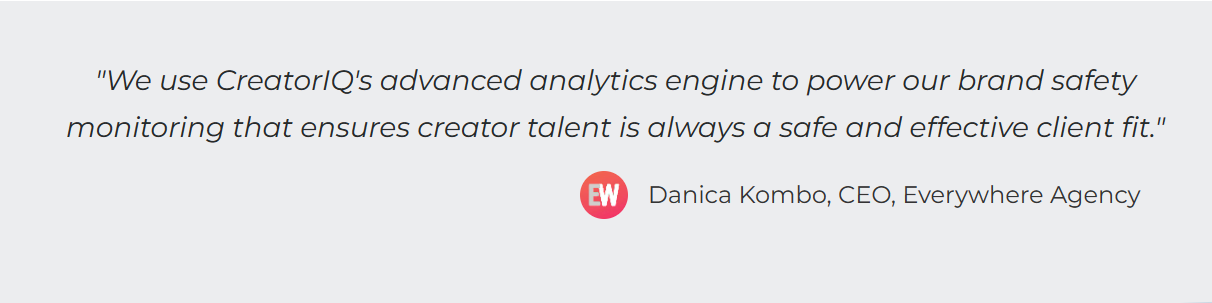
🎯 Include testimonials
I don’t see the need to stress the importance of social proof—be it awards or testimonials—on a product review page.
But if you need inspiration drafting a high-converting one, here’s an example from Creator IQ to guide you:
🎯 Sparingly use CTAs
Without a CTA, prospects will quickly turn to fleeting consumers.
But that doesn’t mean you should bombard them with a shiny “Request a demo” or “Sign up now” button at every turn.
Only include CTAs in your product review page when your narrative requires it, probably at the beginning, middle, or end of your page.
X vs. Y content is a competitor comparison content that compares your SaaS offerings with a worthy rival.
It provides clear, direct, and unbiased information to:
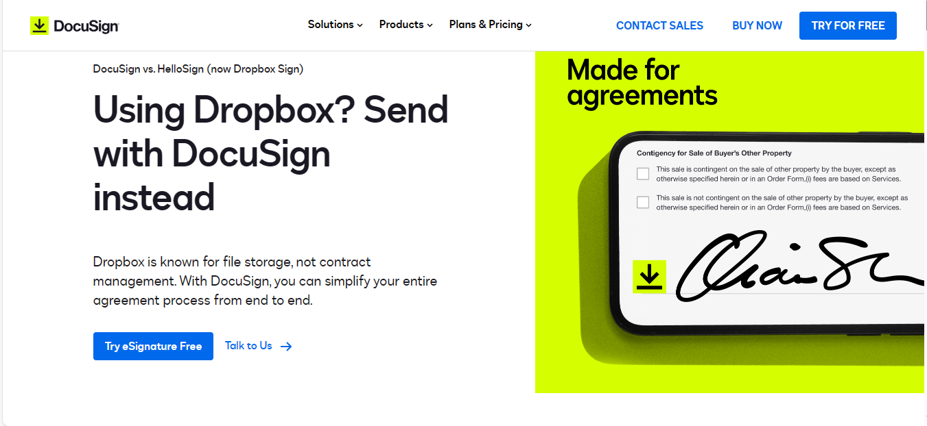
You can design an X vs. Y content as a landing page: Docusign vs. Dropbox sign:
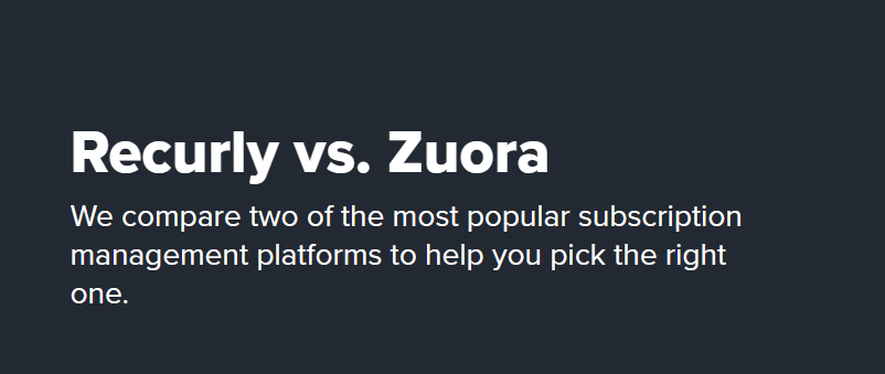
Or as a blog: Recurly vs. Zuora:
For now, let’s iterate the importance of X vs. Y content.
Well, in a nutshell, it’s one of the few competitor comparison content you can use to vie with the behemoths and promising start-ups in your space.
In an X vs. Y contest, you go head to head with a brand that:
One major mistake brands make in their X vs. Y campaigns is vying with brands they can outflank just to make themselves feel or look superior.
But indeed, if you want to feel superior, you are better off with a Top alternative to X content.
With that said, X vs. Y content is also powerful for nurturing brand LOYALTY.
Woven around genuine narratives, X vs. Y content gives subscribers a point-blank view of the WHY behind your SaaS offerings.
It allows prospects to:
The gist is that, with X vs. Y content, you don’t need to take up the competition relying on an industry-accepted comparison checklist.
NAH!
Instead, you can focus on winning the hearts and minds of a SPECIFIC audience by:
But you need to do it with a content type that’s informative, inspiring, and can easily rank on Google, which brings us back to an issue we previously overlooked:
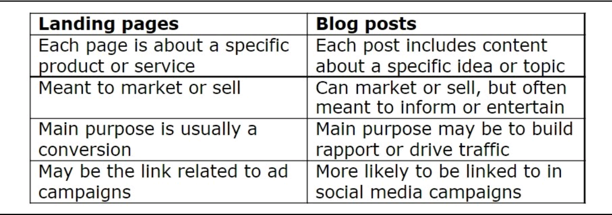
Competitor comparison landing pages provide information about a specific service or product. Its goal is to make people take a conversion-based action.
Conversely, software comparison blogs are more general, providing informative content that can help drive traffic and build trust with your audience.
Now, there’s no denying that Comparison pages are sales-y. So yeah, its approach to content is somewhat biased.
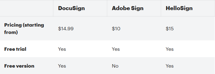
For example, here’s what DocuSign had to say about DropBox Sign on its comparison page:
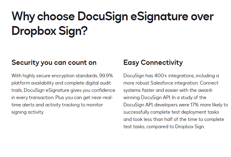
Indeed, DocuSign’s X vs. Y page has a wonderful design.🙂
But sadly, the content was hyper-focused on how it outperforms Dropbox. And there was no room for readers to learn about how Dropbox fares.
Compare DocuSign’s page to how Recurly talked about Zuora on its sales-focused comparison blog:
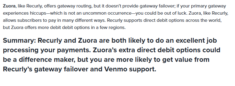
On here, Zuora gets a fighting chance.🙂
And readers are provided with an honest read. But the design is nowhere near that of DocuSign’s landing page.
Overall,
Comparison blogs stand a BETTER chance of getting your SaaS the ranking and traffic it deserves compared to landing pages.
But there’s no denying that competitor comparison landing pages ALLOW for more catchy on-page designs than blogs, which brings us to my recommendation:
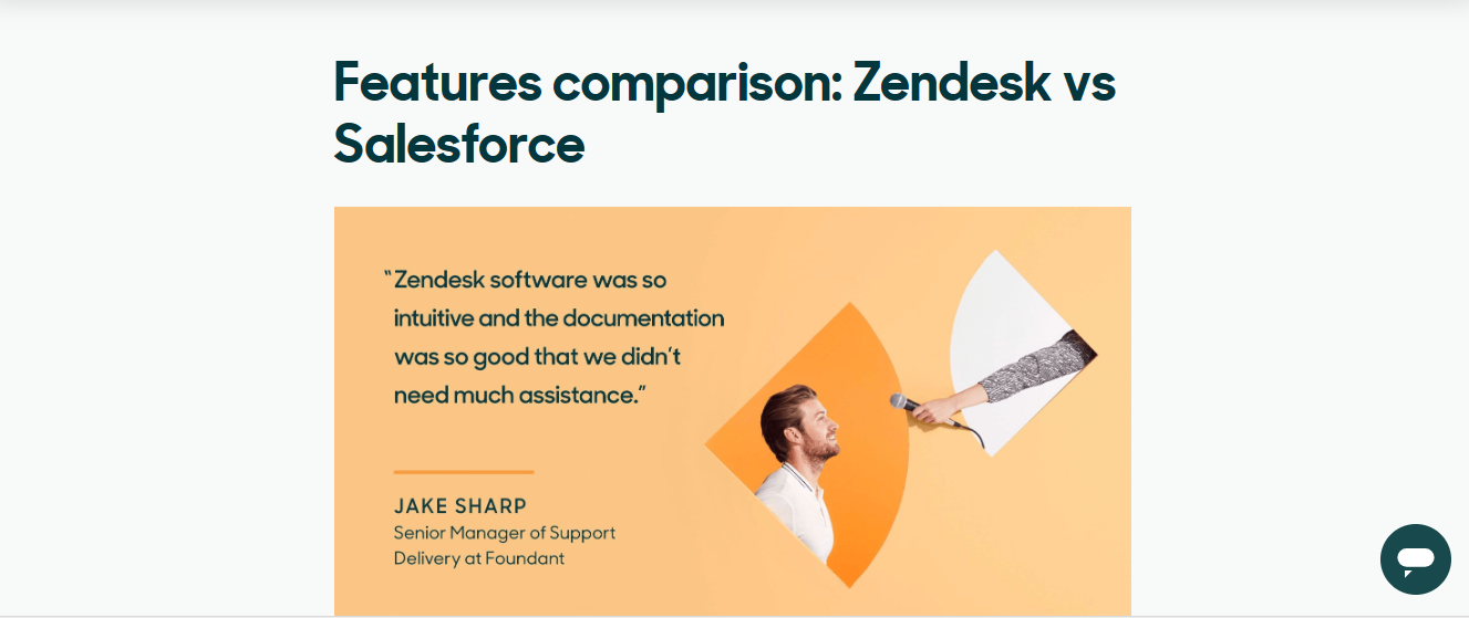
Hybrid comparison landing pages. Here’s an example from Zendesk:
And another hybrid landing page from Podia. 🙂

Not every SaaS brand in your niche is your rival.
And why’s that?
Well, not all competitors can help you win the hearts and minds of ideal subscribers.
To identify a worthy rival, a good competitor for your X vs. Y content, check for,
Having a rival worthy of comparison does not mean their cause (overall WHY) is moral, ethical, or serves the greater good.
It means they excel at certain things and reveal where we can improve—how they play the game challenges, inspires, and forces us to improve.
🎯 Analyze search intent
If you have a well-known SaaS, it’s easy to analyze search intent and find the right keyword. You can start with Google’s suggest feature.
Type “your brand name vs.” in Google search and… example:
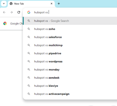
If your brand is unknown, type in a rival’s name instead and take note of all the competitors listed.
Next, use the “Discover new keyword” feature on Google keyword planner to analyze average monthly searches and the “top of page bid” range.
Here’s an example of the “Hubspot vs.” keyword:
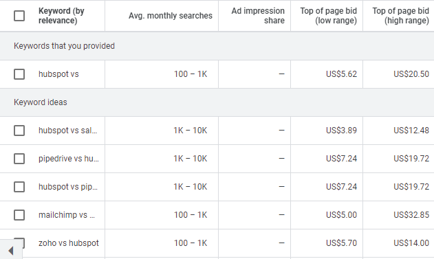
You can kick off your X vs. Y campaign by going head-to-head with competitors having a high “top of page” bid.
Or you can start with less-known competitors, as it will be easier to get a good ranking, especially if it’s a new startup that popped out with a lot of funding.
It all depends on how much you want to invest.🙂
🎯 Focus on Buyer Personas
You can’t woo everyone in your target market with your X vs. Y campaign.
Even with a best-in-class product, a lot of potential users will still be misfits.
So, instead of going toe-to-toe in an effort to steal your competitors’ audience, focus on carving out your own space.
Focus on speaking to ideal subscribers represented by detailed buyer personas, not the entire target market.
This way, you can avoid scope creep and review only features relevant to your best-fit customers.
🎯 Create a comparison hub
Prospects who trust you enough to read your X vs. Y content want to see how you stack up with a particular competitor.
But that doesn’t mean they won’t find other comparison articles useful.
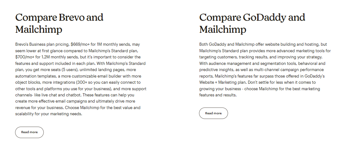
For example, a prospect choosing between Brevo and Mailchimp can draw insightful takeaways from a Godaddy vs. Mailchimp comparison page.
That’s why it’s super important to create a side-by-side product comparison hub. Here’s an example from Mailchimp:
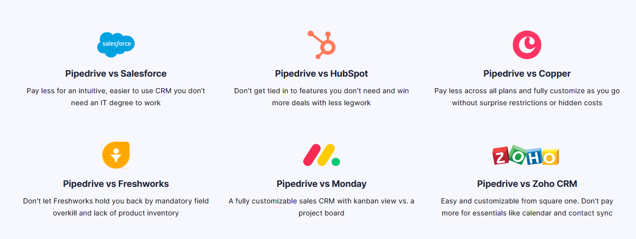
Or seek inspiration from this project management software comparison hub from Pipedrive, it’s more robust than the aforementioned example, but of a simpler nature:
🎯 Indulge an infinite mindset
X vs. Y software comparison is not a finite game.
It’s not like a football game with defined rules or definite winners.
Regardless of what you do, certain people will still value your rival’s product over yours.
And sadly, no marketing or sales tactics can change this.
So instead of trying to woo everyone with your product, identify:
Then, shamelessly build your X vs. Y campaign around how well you and your rival can meet the finite needs of this audience now and in the future.
🎯 Prioritize transparency
Prospects shy away from branded X vs. Y comparison pages because of content like this:
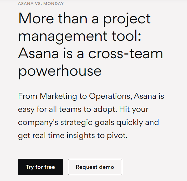
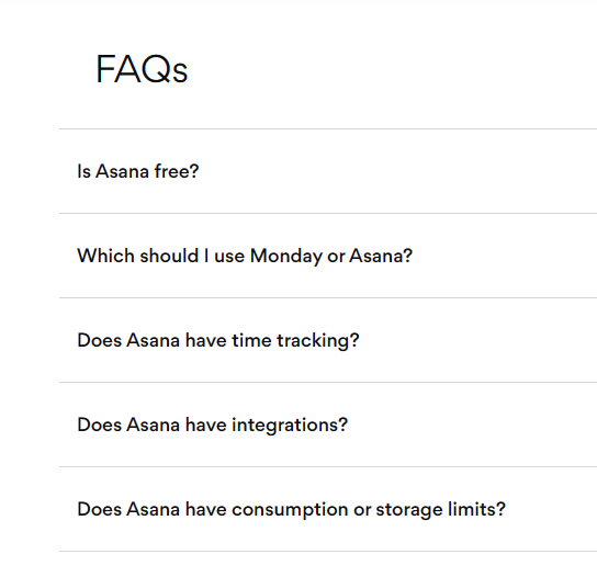
In this Asana vs. Monday product comparison example, Asana didn’t reference Monday’s positioning or USP.
From top to bottom, Asana tooted its own horn.
And even in the FAQ where the “which should I use” question popped up, “Asana or Monday,” the writer didn’t make any direct reference to Monday:
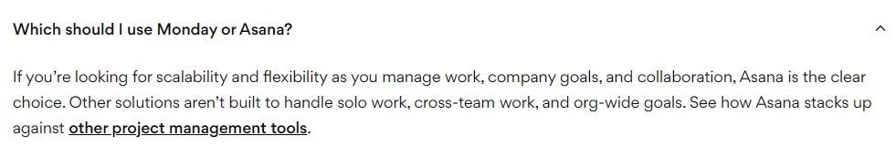
It was as if they were shy or scared to talk about how Monday stacks up, which is a deal breaker for serious subscribers.
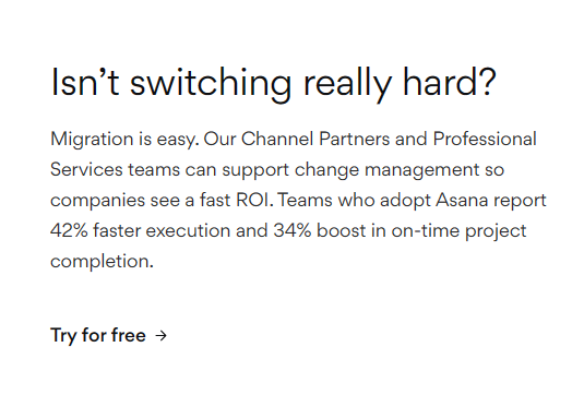
While I love Asana’s drift design, if you want to reel in sales with your comparison pages, prioritize transparent content like this:

Or go for fun and witty stuff that oozes genuine opinions:

Because as much as you want to come out on top, the only way your content can move the needle or inspire loyalty is if you give competitors genuine credit where credit is due.
🎯 Use interactive designs
Show, don’t tell is an age-old marketing cliche that’s forever evergreen.
Truly, some things are better shown than told.
Use GIFs, videos, and other interactive visual formats to make key value differentiators STICKY.
You can draw inspiration from this Anaplan vs. Pigment product comparison page design.
🎯 Include relevant testimonials
Here is what I mean by relevant testimonials:
Not this:

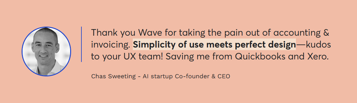
Simple difference:
The testimonial from Wave:
On the other hand, the testimonial from Twist perpetuates no real value. It’s pretty vague and generic.
🎯 Don’t forget FAQs
FAQs are super important in X vs. Y comparison content, especially if your industry has an awareness gap.
You can finalize your X vs. Y content with a simple FAQ section like this:
Or sprinkle relevant questions across content as Asana did here:
🎯 Engage skimmers with skimmable content
Harsh truth: subscribers rarely read comparison content from top to bottom.
On the best occasions, they skim.
So yeah, you want to make your X vs. Y content as skimmable as possible.
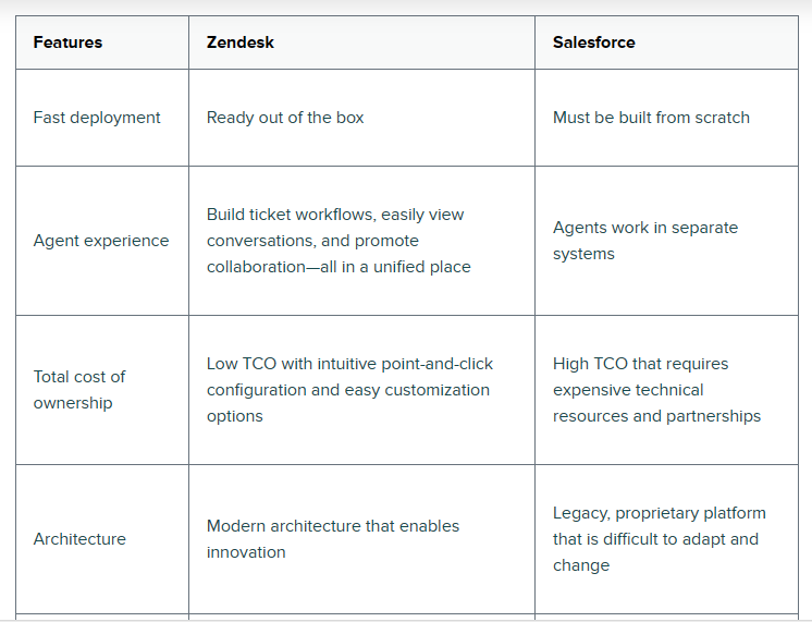
You can start by creating a competitor comparison table similar to this Zendesk example:
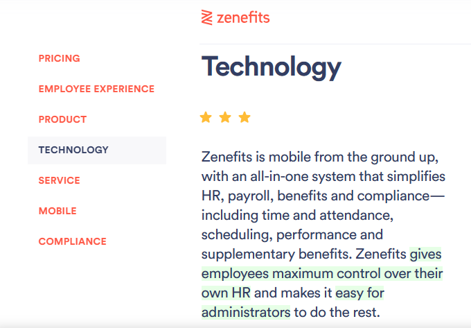
For content flow, this Zenefits interactive sidebar is a beautiful example:
Just don’t forget to break long tables into expandable sections and avoid listing unnecessary features.
Prioritize features that inspire subscribers to sign up or switch tools speedily, e.g., persuasion elements like zero-cost migration support.
Three guys walked into a bar… oops, you’ve probably heard that one.🙃
Three little pigs had a house of… still sounds obvious?
The three musketeers… The three wise men… the three idiots… And on and on and on.
You see, three (3) is a powerful number, and Mark Moore brilliantly merged content with context in this little Ted Talk. It’s worth a listen. 😎
With that said, let’s look at how you can maximize the POWER of three to create result-driven SaaS comparison blogs.
Bear in mind that there are two types:
📍 X vs. Y vs. Z comparison (Competitor vs. competitor vs. your brand)
📍 X vs. Y, then Z comparison (Competitor vs. competitor, then your brand.
Let’s dive in.
X vs. Z vs. Y content is a three-way comparison page where you pair three SaaS brands to identify the best fit for different subscribers.
It involves pitting your brand with TWO worthy rivals or well-funded startups to SPOTLIGHT the best fit for a target market.
X vs. Y vs. Z comparison content is crucial for GENERATING demand, STEALING mindshare, and PIGGYBACKING off the category leader’s search demand.
You see, in every SaaS market, there are top dogs and underdogs—tools with millions of subscribers and then SaaS tools scrambling to land a few thousand.
If your brand is new to the market (even if your SaaS has better features than the competition), it’s tagged an underdog.
Why’s that?
Well, for one, it’s unknown.
A Majority of the market doesn’t know your SaaS exists. They do not know your brand and are, in most cases, unwilling to look.
To draw their attention, you must take up their fair-weather champions (or popular brands) heads-on.
You need to show you can stand your ground against worthy competitors.
You must show that your SaaS has what it takes to become their new champion.
And that’s where X vs. Y vs. Z articles come in.
X vs. Y vs. Z software comparison blogs pit your product with that of category leaders to make your SaaS a popular consideration among subscribers.
🎯 Focus on your target market
It’s easy to get caught up in the features and benefits debate that you forget your target market.
To create X vs. Y vs. Z content that yields results, focus on the specific group of people most likely to buy from you.
In your header (or headline), plainly state who you’re reviewing these products for. Are they educators? realtors? engineers? marketers? etc…
If you’re feeling confused about how to go about it, kindly draw inspiration from the ultra specificity of SkoolBeep’s comparison blog headline:
🎯 What makes a good buying decision?
Not every potential user knows what they want—or what to expect—from a good SaaS product.
So, it’s common to find subscribers scouring an X vs. Y vs. Z review for direction.
To make such users feel welcomed and confident about their choices, highlight the criteria behind a good buying decision.
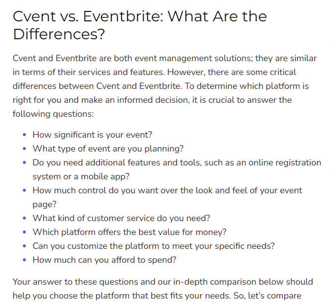
Need hand-holding? Be my guest and explore this Cvent vs. Eventbrite review for inspiration:
🎯 What makes a good buying decision?
Not every potential user knows what they want—or what to expect—from a good SaaS product.
So, it’s common to find subscribers scouring an X vs. Y vs. Z review for direction.
To make such users feel welcomed and confident about their choices, highlight the criteria behind a good buying decision.
Need hand-holding? Be my guest and explore this Cvent vs. Eventbrite review for inspiration:
🎯 Prioritize hybrid landing pages
Most SaaS brands publish their X vs. Y vs. Z comparison content as blog posts, similar to this Hellosign vs. Docusign vs. Signhouse review, mainly because of the SEO perks it attracts.
If you’re on a budget, that’s okay!
Publishing your X vs. Y vs. Z content as a regular blog is still a good practice, but it’s not the best option when prioritizing skimability.
For optimal conversion, I suggest you invest in hybrid landing pages. You can explore this Shopify or Selzy’s three-way review for inspiration.
🎯 Thoroughly review prices
It’s common to relegate software price comparison info to biased, one-line statements or inconsequential tables like this:
Indeed, simple, skimmable tables like the one above are essential.
But come on! X vs. Y vs. Z articles are generally long reads…
Subscribers who frequent them before making a decision expect in-depth content covering every angle essential to the buying process—if you leave them hanging, you’re leaving money on the table.
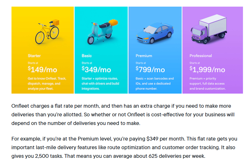
You can draw inspiration from the price review section of this Postmate vs. Onfleet vs. Circuit blog:
🎯 Give prospects an honest read
I love the honest and unbiased manner with which Circuit began their X vs Y vs Z comparison:
Sadly, they ruined the read halfway by using one-sided case studies, which left the whole thing reading like a sales pitch:
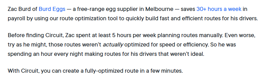
It’s a common mistake content writers make when they get too attached to the product; they create one-sided arguments without knowing. 😔
But hey! You can’t afford to fall for a salesy approach when conversion is the goal, because potential users will effortlessly see through it.
So do everything you can to keep your X vs. Y vs. Z reviews as honest, transparent, and nuanced as possible.
X vs Y, then Z content is also a three-way comparison, but not in the X vs. Y vs. Z sense.
In an X vs. Y, then Z comparison, two competitors or prospects (mostly behemoths) take the stage as the primary topic while your tool stays on the sideline, waiting to be introduced as a good alternative in strategic corners where you can easily score points.
It entails evaluating two SaaS brands for a target audience where your tool is a fine alternative or excellent intermediary.
The importance of X vs Y, then Z content is similar to X vs. Y vs. Z.
At least it can help you steal mindshare and piggyback off search demand.
But there’s one subtle yet significant difference.
X vs. Y, then Z content works best when you aim to win a defined market segment.
Here’s the gist:
With an X vs. Y, then Z content, you’re not actively participating in the comparison debate.
Instead, you’re pitting two top brands against each other with your product on the sidelines, waiting to join the conversation ONLY when the spoils are ripe.
Wondering how? Here are two tried and true X vs. Y, then Z strategies with examples.
🧨 Big fish, small pond
The big fish, small pond strategy involves carving off a piece of your target market where the rules are slightly different, just enough to give your product an edge over the category leaders.
You are not trying to change the purchase criteria for the market; in fact, you just have to prove that your product does a “good enough” job in specific areas when compared with the category leaders.
Here’s an example from a Stripe vs. PayPal review designed by Wise.
Throughout this review, Wise didn’t actively participate—they remained on the sidelines. It was entirely a Stripe vs. PayPal thing:
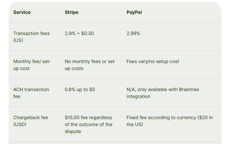
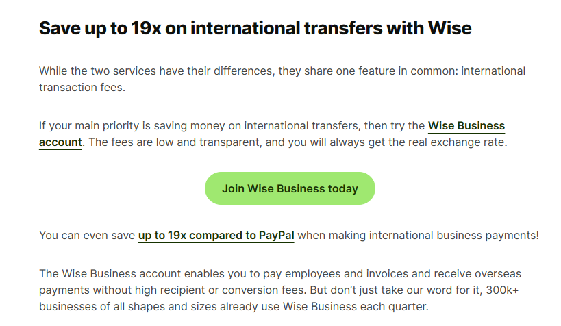
But after talking about all the remarkable features Stripe and PayPal offer, plus how they compare, Wise concluded with how it BEATS both SaaS products on a major pain point: lower transfer fees:
🧨 Intermediary
You see, X vs. Y, then Z reviews can also take a more subtle turn, something along this line:
Instead of reviewing two rivals, you can evaluate how prospects (or other tools) fare against each other and then finalize with how your SaaS product serves as a good intermediary.
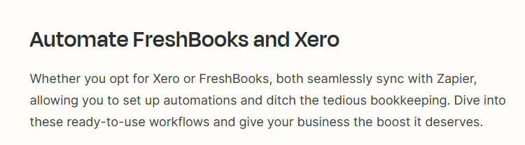
Zapier is among the few brands heavily invested in this strategy. For example, see how they finalized their Freshbooks vs. Xero review:
Or better still, here’s a more nuanced example from Semrush:
Notice how Semrush concluded their Shopify vs. WordPress article with the need for a site audit? Yeah, that’s an X vs. Y, then Z comparison blog in action. 🙂
🎯 Focus on best-fit customers
As much as X vs. Y, then Z blogs can easily help you steal mindshare; not every subscriber will switch sides at the sight of your product, even if it offers better value. 😶
Your best bet at success is focusing on best-fit customers—subscribers your product explicitly serves.
For example, see how Semrush, although reviewing two functional-fit products, “Shopify vs. WordPress,” still focused on its best-fit customers: e-commerce merchants:

This way, you can avoid scope creep and review only features relevant to ideal subscribers.
🎯 Map features to benefits and values before reviewing
Features, benefits, and values mean different things.
Here’s a perfect “features to benefits and values” depiction from Converkit’s product review page:
By mapping each brand’s RELATED features to benefits and values, you spotlight the WHY, WHAT, and HOW behind your product.
🎯 Don’t be intrusive
Indeed, X vs. Y, then Z comparison content requires that your SaaS product remain on the sideline till an opportunity to stress its power features arises.
Well, such opportunities don’t always exist in plain sight. Most times, you have to create room for it.
And that’s where most SaaS writers go wrong. 😶
In an effort to toot their brand’s horn, they ignore content flow, offering unwarranted recommendations at the slightest chance.
If you want your X vs. Y, then Z content to convert, you must avoid such mistakes at all costs, because being intrusive will make your words sound salesy and boring to readers.
Only introduce your product when confident readers will find value in it.
Here’s an example from Hotjar for inspiration:
🎯 Use lots of white spaces
X vs. Y, then Z blogs are long, complicated reads.
Using bullet points, pro tips, and tables to make your content skimmable might not be enough to keep potential users glued.
Take it further with white spaces and unique colors.
Or, in more easy-going words, optimize your blog like a hybrid landing page.
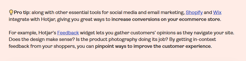
You can draw inspiration from Hotjar’s Shopify vs. Wix review.
🎯 Conclude with an actionable summary
Your conclusion is the final touchpoint of your content.
Fleeting and skimming subscribers (as well as avid readers) usually touch base at this junction before waving goodbye.
That’s why concluding with an actionable summary is SUPER important.
The easiest way to do this is by
—Highlighting the major differences between the two SaaS you reviewed
—and then wrapping up with how your SaaS product serves as a good alternative or intermediary.
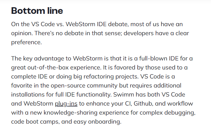
Here’s a prime example from Swimm:
Top alternatives to X content sheds light on how good your SaaS and a host of other products vie compared to an industry behemoth.
Here’s an example from Zonka:
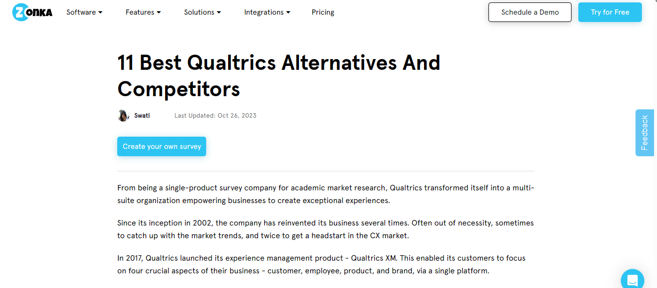
Zonka used this blog to talk about Qualtrics (an industry leader in academic market research) before positioning its product and a handful of other tools as the next best alternative.
Overall, alternatives to X content are usually listicles comparing niche-specific tools, not landing pages where you only talk about your product.
With so many SaaS products offering similar features, you’ll always find subscribers searching for the next best alternative to
—Either a tool they are already using
—Or a purchase they are about to make.
And they do this for a host of reasons that are sometimes unpredictable. Obvious ones include:
In essence, alternatives to X content are important because they can position your brand (in a new or existing market) as the next best thing since sliced bread. 🙂
🎯 Focus on use cases
For most comparison content, I recommend a sharp focus on ideal subscribers’ pain points and motivations.
But for an “alternative to X” review, my two cents are on use cases.
And by use cases, I mean insights into real-world usage scenarios of each tool. Insights such as:
You can draw inspiration from this HelpScout review:

Pro tip: Note that the idea of you focusing on use cases is simply a tried and true conversion strategy for “alternative to X.” It’s not carved in stones. You can always switch focus depending on the scope and depth of your competitor comparison campaign.
🎯 Speak to a defined audience
This is the typical headline in most “alternative to X” comparison articles:

Sadly, such headlines are generic and lack specificity; they speak to no one. So nope! They don’t convert.
And while the above headline can easily rank on Google, it won’t pull as much weight as this ultra-specific, targeted headline from Podia:

🎯 Capitalize on the CONS; scrutinize the PROS
Every industry behemoth has its power features as well as its downsides.
An obvious distinction is that while most behemoths provide out-of-the-box solutions for enterprise clients, their pricing isn’t always budget-friendly for startups.
Or, in some cases, such as in this Whova content, they might not offer suitable solutions for a highly desired feature in a niche market.
In either case, the idea is to capitalize on the cons.
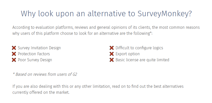
Begin your alternative to X content by briefly (and unbiasedly) reviewing the downsides of the industry behemoth for which you’d like to offer alternatives.
Here’s a tried and trusted example from QuestionPro:
But hey! Don’t just state the downsides.
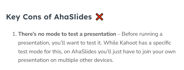
While it’s okay to capitalize on the cons, you’ll score a few well-deserved points if, at strategic turns, you also highlight the pros in comparison to the alternatives listed.
Wondering what I mean by strategic turns? Here’s an example from AhaSlides:
🎯 Design as a listicle
By listicles, I don’t mean numbered content; I mean skimmable content.
“Alternative to X” blogs are usually long-form blogs. So if you are not careful, you’ll find your ideas behind blocks of text like this:

(A red flag for subscribers looking to make quick and insightful decisions.)
Anyways, you can look to this Kahoot alternative content by AhaSlides for inspiration on how to optimize for skimability.
🎯 Ensure every image tells a story
Leading with a screenshot of each brand’s homepage is now outdated and old-fashioned. 😶
Why’s that?
They rarely contribute anything to the overall read.
But that doesn’t mean creating an alternative to X content without visuals is okay. Because, yeah, avid readers will get bored. 🥱
In any case, I advise using descriptive, in-app screenshots of any feature you review.
And if you’ve got the budget and time, endorse GIFs or other visuals that give readers an “at-a-glance” overview of what to expect.
🎯 Make subscribers desire your CTA
In the heat of “alternative to X” content creation, writers forget that for conversion to happen, the thought of “sign up,” “Buy now,” “Get a demo,” etc, needs to become the subscriber’s idea.
Potential users need to desire your CTA at just the right time, otherwise they will walk. Subscribers need to feel like it’s their decision, not yours.
The easiest way to do this is by positioning your CTA close to skimmable, easy-to-find sections of your content—areas that contain the WHY, WHAT, and HOW of your content.
A “Best X tool” blog is a type of software comparison content you can use to spotlight your SaaS unique offerings in a list containing:

Best X tool blogs are among the few comparison content that serves navigational and commercial needs.
It can help subscribers find a stack of synchronized tools for their arsenal—tools aligned with their budget and creative needs.
These blogs usually offer genuine opinions on how a set of tools can help creatives enjoy confident workflows.
Some other key advantages of “Best X tool” content include:
🎯 Focus on market segments
The best SaaS tools are known to serve individuals in diverse industries.
HubSpot, for example, doesn’t just serve marketers; it’s also a go-to hub for salespeople and RevOps teams.
That’s why when creating “best X tools” blogs, market segmentation is the way to go.
—Find out which audience each SaaS on your list serves best
—and then highlight the WHAT and HOW behind each tool’s offerings within the market.
Here’s an example from Zapier:
🎯 Use descriptive power words in your headline
Nope! This is not an invitation to build your “best X tool” content around clickbait.
Instead, it’s a navigational guide to help skimming readers understand your content in an instant.
Include words like “cheap, free, paid, budget-friendly, one-man team, budding freelancers, close-knit teams, etc.” in your headlines; this way, readers know exactly what to expect from the read.
🎯 Sate each tool’s market segment in your subheadings
I love that “best X tools” comparison content doesn’t always have to follow a numbered structure.
The first tool on your list does not necessarily need to be the best tool for everyone. It just needs to be the stand-out tool for a defined segment or creative need.
For example, see how Zapier’s comparison page neatly defined how each PM tool on its list serves specific individuals in diverse market segments:
🎯 Highlight comparison criteria
As much as potential users love a good “best X tool” blog, don’t forget that they will still take almost every advice they find on a branded website with a pinch of salt.
The easiest way to make your recommendations hold water is by creating a competitor comparison chart that states why each SaaS tool made your list. In your chart, you can include:
Just SHOW your testing and comparison criteria. It doesn’t have to be long or bulky—something as short and precise as this Moz paragraph often does the trick:
🎯 Include personal findings
A “best X tool” review built around facts and figures might rank high on Google and even attract a few clicks, but it won’t yield maximum conversion overall.
Why’s that?
Readers who approach “best X tool” reviews crave personal opinions.
They want to know “WHY” you deemed a specific tool best for a defined market segment beyond the facts and figures accessible via the software provider’s website.
These subscribers want to be sure you used the tool and have real-world experience of how it works. And that your content is not built on hunches, assumptions, or, worse off, monetary incentives.
Once again, Zapier perfectly embodies this strategy:
And hey! You can learn how to go about it here. 🙂
🎯 Summarize with tables or TL;DR
Straight to the point, actionable information is the order of today’s digital world. So you’ve no reason to ignore the needs of skimming readers.
If you’re reviewing multiple SaaS products and can’t lead with a “too long, don’t read” (TL;DR) section, then please draw inspiration from this CRM org comparison table example:
Now that you know everything there is know about software comparison and the applicable content types, let’s address the elephant in the room:
To kickstart a themed software comparison campaign, you need some SEO skills—keyword research knowledge, to be precise.
The process is technical and requires a few FREE and paid tools.
If you don’t like “technical,” I’m sure you are wondering: Why is this important?
Well, keyword research is crucial to ranking your comparison pages or blogs on Google. Plus, it helps you figure out the type of comparison content that will work best for you.
To save you the hassle, I’ll explain the two-step process using tools you can access for FREE. So sit tight. 🙂
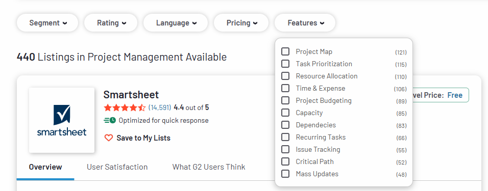
G2 is among the few software comparison sites with a robust list of the most advanced SaaS tools.
Simply visit the platform and enter your software category.
For example, let’s say your SaaS tool is in the project management niche.
Visit G2 and type the software CATEGORY, “e.g., project management,” into the search portal.
And you’ll be graced with a page like this:
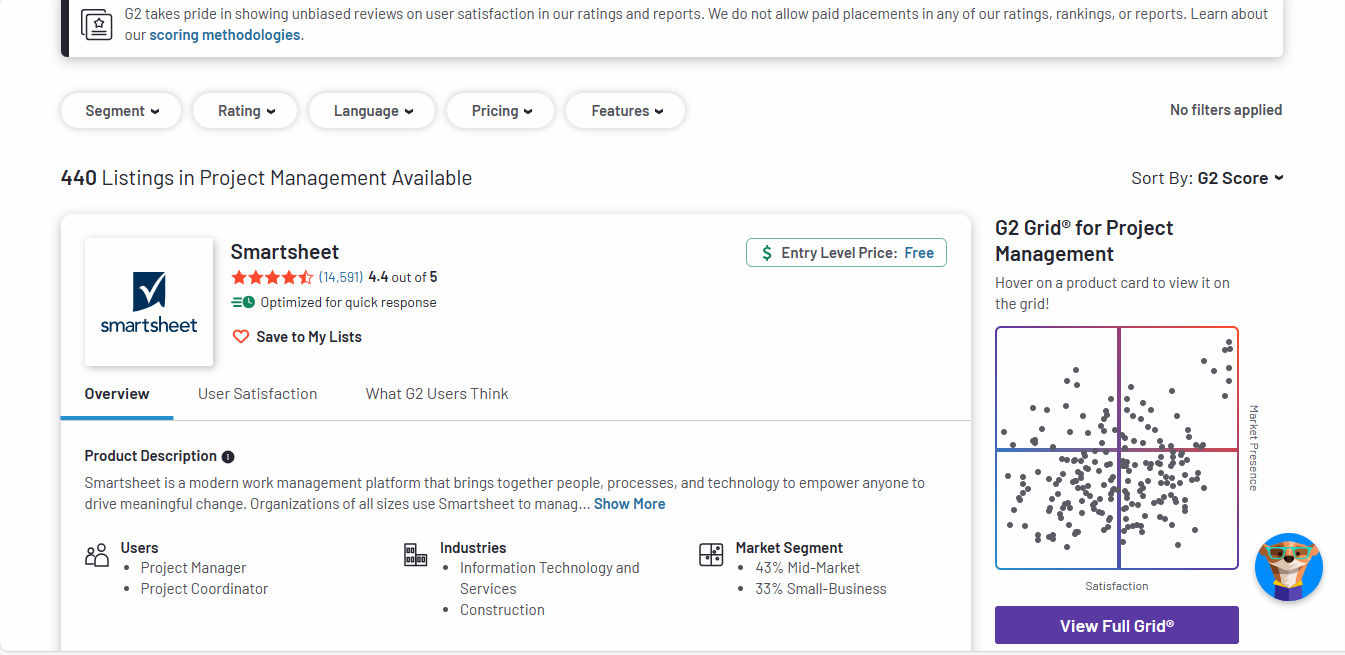
Note the number of listings, 440. That’s a lot.
It will take forever to write a comparison blog comparing all 440 listings. And running keyword research against all possible matches will also take forever.
So, let’s break the list down a bit.
To do this, answer the following questions:
Answering the above questions will help you categorize the competition further using G2:

For example, let’s say your project management tool is perfect for task prioritization and a good tool for the enterprise market.
Here’s what you’ll find:
After categorizing, we’re left with 46 listings.
Now, this is a list you can work with. 🙂
If you have the budget, you can efficiently run an X vs. Y campaign on all 46 listings—going toe to toe with all viable competitors.
But since, in most cases, budget is a hindrance, and there are other more subtle yet promising comparison content types like X vs. Y vs. Z and top alternatives to X, let’s go a step further.
To break the list down further, you will need to focus on KEYWORDS.
And for that, you need an SEO tool.
There’s Ahref, Semrush, and a bunch of paid tools to aid in this endeavor.
However, to help you rank your comparison blogs even when on a budget, I’ll use Google keyword planner. It’s FREE.
Google designed its Keyword planner for Google ad campaigns. But over the years, it has become a tested, approved, and trusted tool for SEO research.
So yeah, you can start by creating a Google ads account. This will grant automatic access to the keyword planner:
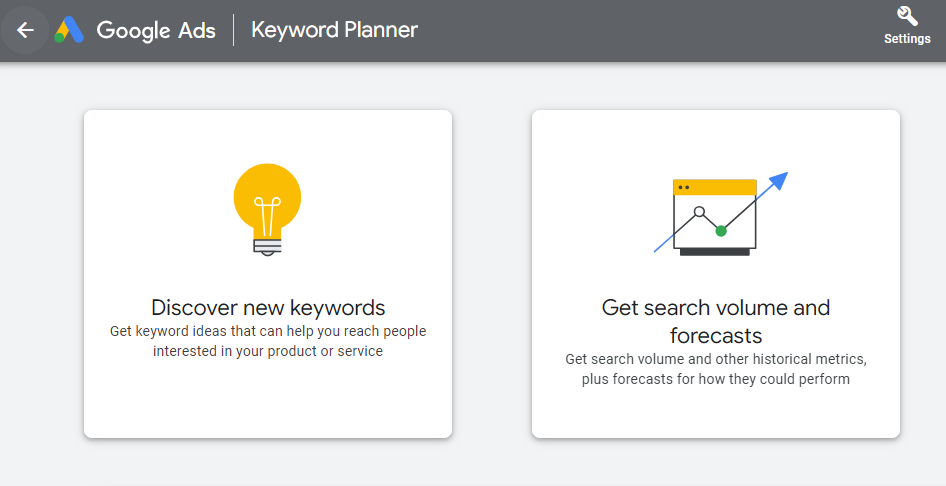
On the keyword planner’s dashboard, click the “Discover new keyword” option and input the name of a noteworthy competitor from your G2 listings. Include the term VS at the end of the listing.
For example, Asana vs:
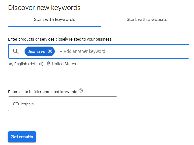
Click “Get results” and then look for keywords that compare “Asana” to the other project management tools on your list:
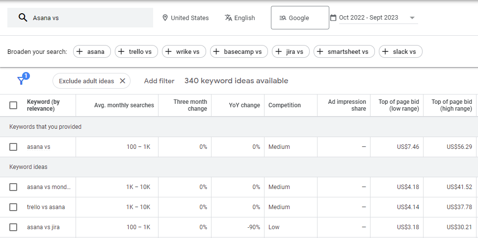
I got 340 keyword ideas. Another a lot to take in.😓
But thankfully, not all are valuable. So, let’s filter for the ones that are easy to rank for and offer good value for money.
Use the filtering option to filter your search so it only shows keywords above or below a certain level of competition (average monthly search volume).
In this case, LOW:
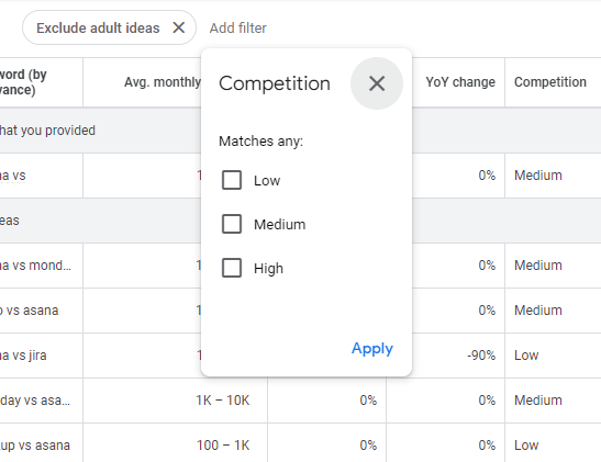
NOTE THAT:
Here’s the result:
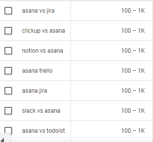
Now you know that, with quality content, you can easily rank for a handful of keywords from the above list.
But this raises another question: Which keyword will MAKE YOU MORE MONEY?
To KNOW, you’ll have to check out each keyword’s commercial intent. It’s top of page bid:
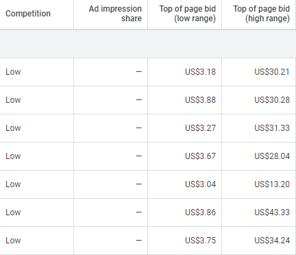
The top-of-page bid shows how much it would cost to place an ad for a selected keyword at the top of Google.
So, to make good money from your comparison campaigns, focus on creating content around keywords with higher top-of-page bids; it reflects ideal subscribers’ search intent. 🙂
Now, that’s that. At this point, you should have a list of high-value keywords you can work with. If that’s the case, I think it’s high time I talked about the unsaid stuff.
Before I get started, know that best practices, especially the ones listed above, are simply what they are: best practices. They are not written in stone. So yeah, they evolve and change with time.
And indeed, there’s no evergreen software comparison template for themed campaigns. Competitor comparison templates can only hold water for so long, no matter how tried-and-true they are.
That’s why, to create a high-converting product comparison page, you can’t rely solely on preexisting knowledge or age-old strategies; you must learn to think on your feet.
And to do that, you must first understand the dynamics of SaaS conversion and how subscribers choose. Here’s a little something to guide you:
A best X tool content talks to prospects with an awareness gap on the best tools available in a niche market. Alternative to X content, on the other hand, talks to prospects enticed by a competitor’s product but still open to options.
X vs. Y vs. Z involves ACTIVELY comparing your SaaS product with two rivals to show how you’re different. On the other hand, in an X vs Y then Z content, you’re still going up against two industry rivals, but with a passive approach—your brand remains on the sidelines and only comes in when the spoils are ripe.
There is no definite answer here. How each piece of content performs depends on the overall theme behind your comparative marketing campaign and how well you wrap each content’s narrative around it.
Evergreen tips on how to write single software reviews & X vs. Y blogs that drive real results.
Let’s see how well Writesonic can help create high-converting SaaS content.

Priceless tips on why your B2B blogs tanked, plus strategies to change the narrative.

Here’s everything you need to make your comparative blogs attract new clients and boost sales.

If you’ve often wondered what goes into a conversion based B2B blog, this is for you.

Insights on how to write high-converting B2B blogs without the sales-y outlook.